
client
The Little Gym
Services Involved
Interior Design / Decor & Styling
the job in a nutshell
To design and furnish a children's education and entertainment venue.
It's a playschool and activity centre in Koramangala, Bengaluru. 3,500 square feet on a quiet street, created by the team behind The Little Gym, whose work has always centred on movement - acrobatics, flexibility, and early physical development. The Yard takes that further, into a shared space for children and families that can hold a genuinely full day. Prenatal sessions in the morning, activities for younger kids through the day, robotics and tuition and evening classes for older ones. The design had to work across all of it without losing its character.
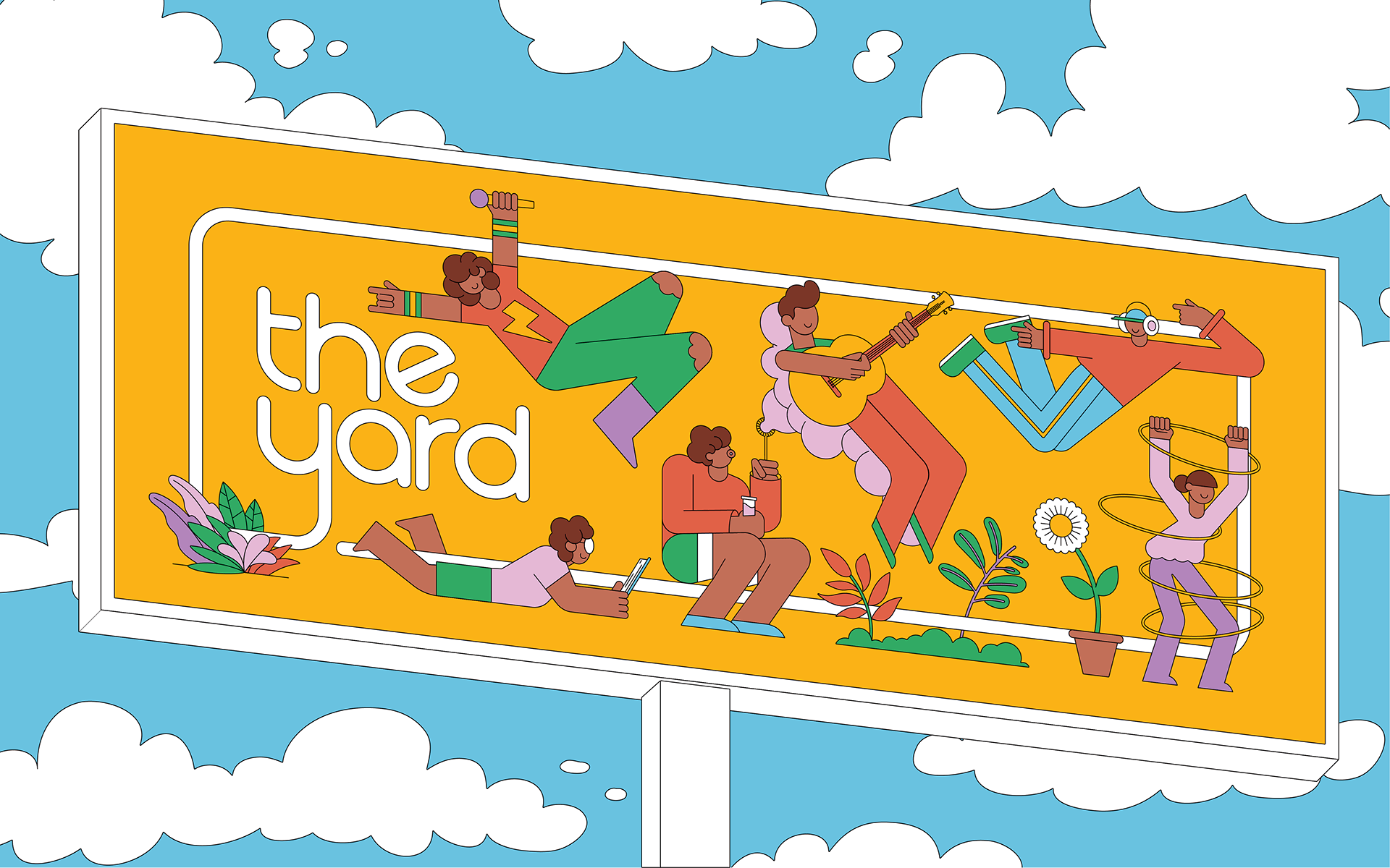
The idea at the centre of the project is the backyard - not as a theme or decoration, but as a way of thinking about how children use space when nobody's directing them.
For most city kids, that kind of space is already gone. Flats, packed schedules, interiors built around adult needs - the loose, exploratory time that a garden once offered has largely disappeared from urban childhood. The Yard is a response to that loss. It makes room for climbing, hiding, building, gathering, performing, and just watching, all inside a city building. This was the kind of brief we got drawn into - not just a spatial problem but a social one. What does a generation of children lose when informal space disappears? And what can design actually do about it?

The project doesn't try to look like the outdoors. No playground references, no fake grass. Instead, it borrows the feeling of a backyard - the freedom, the options, the ability to return to the same place and use it differently each time.
A few ideas shaped how that translated into architecture. Simon Nicholson's Loose Parts Theory - the principle that spaces work better when they can be reconfigured and used in open-ended ways - was a key reference. Adventure playgrounds influenced thinking, too, particularly in their emphasis on agency and on letting children figure things out for themselves. Scale mattered throughout. Most children's spaces are just adult spaces with brighter colours, but here every height, ledge, counter, and opening is calibrated to children's bodies and movement. The Reggio Emilia approach runs through it as well - the idea that environment isn't just a backdrop to learning but an active part of it. Space as participant, not scenery.
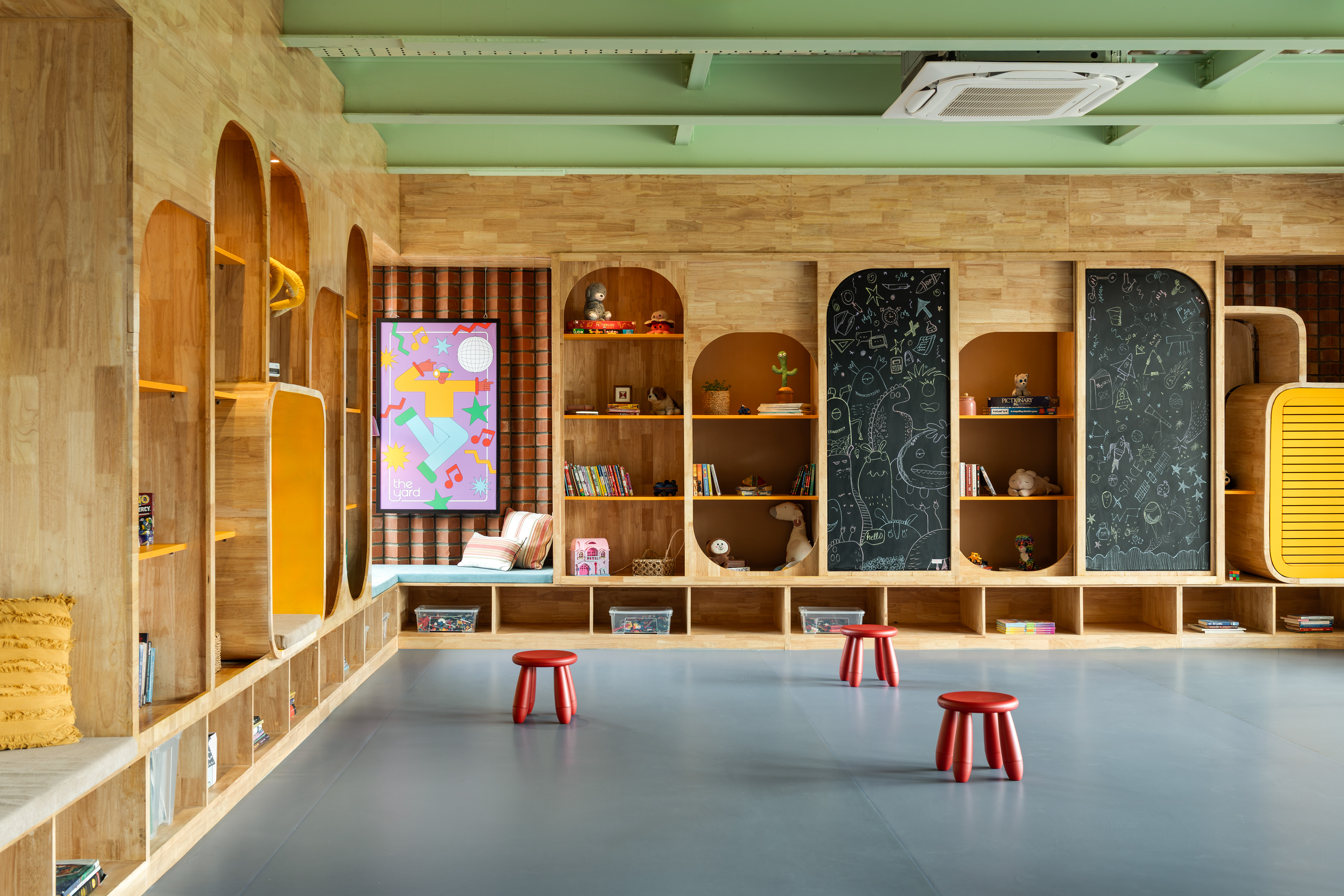
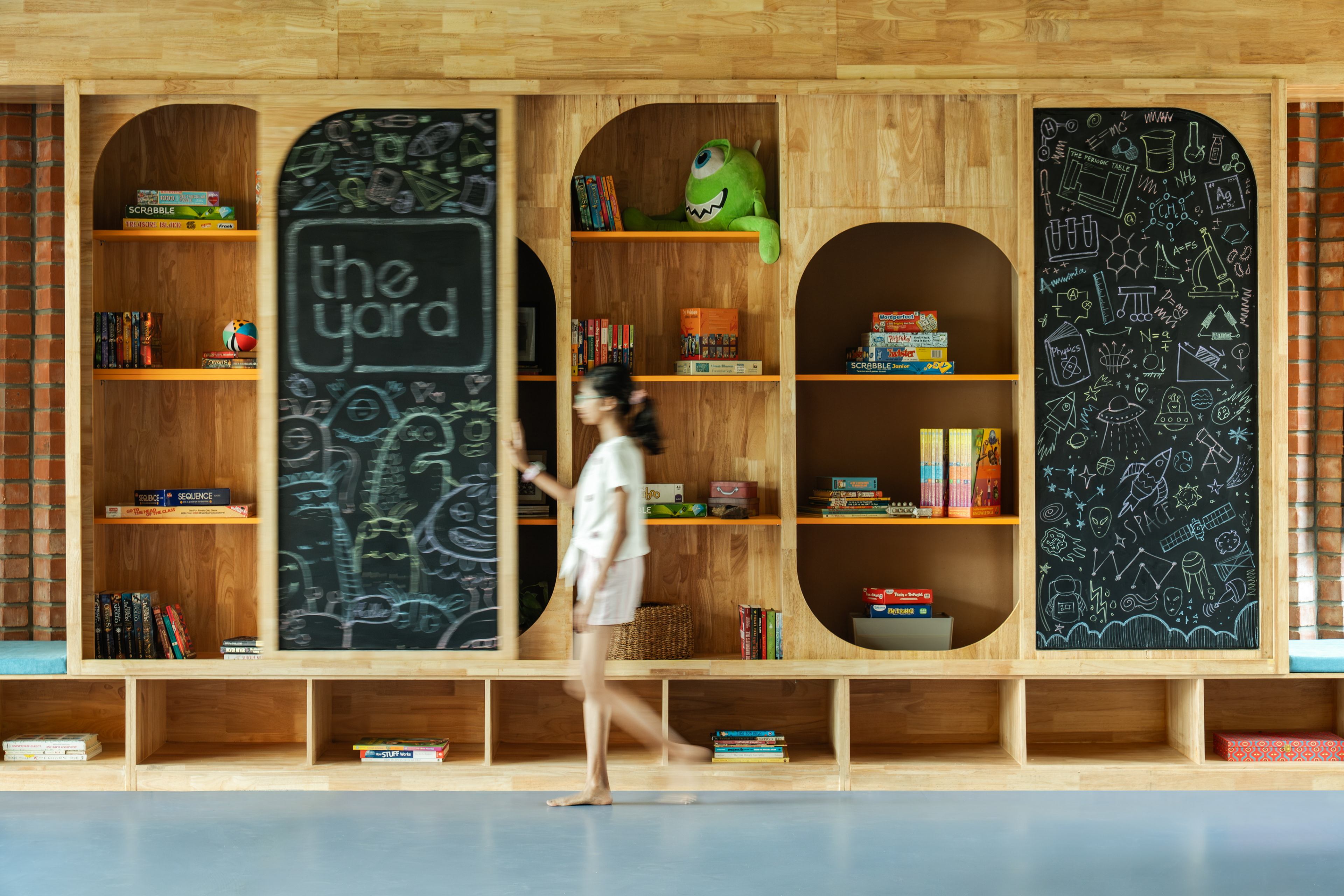
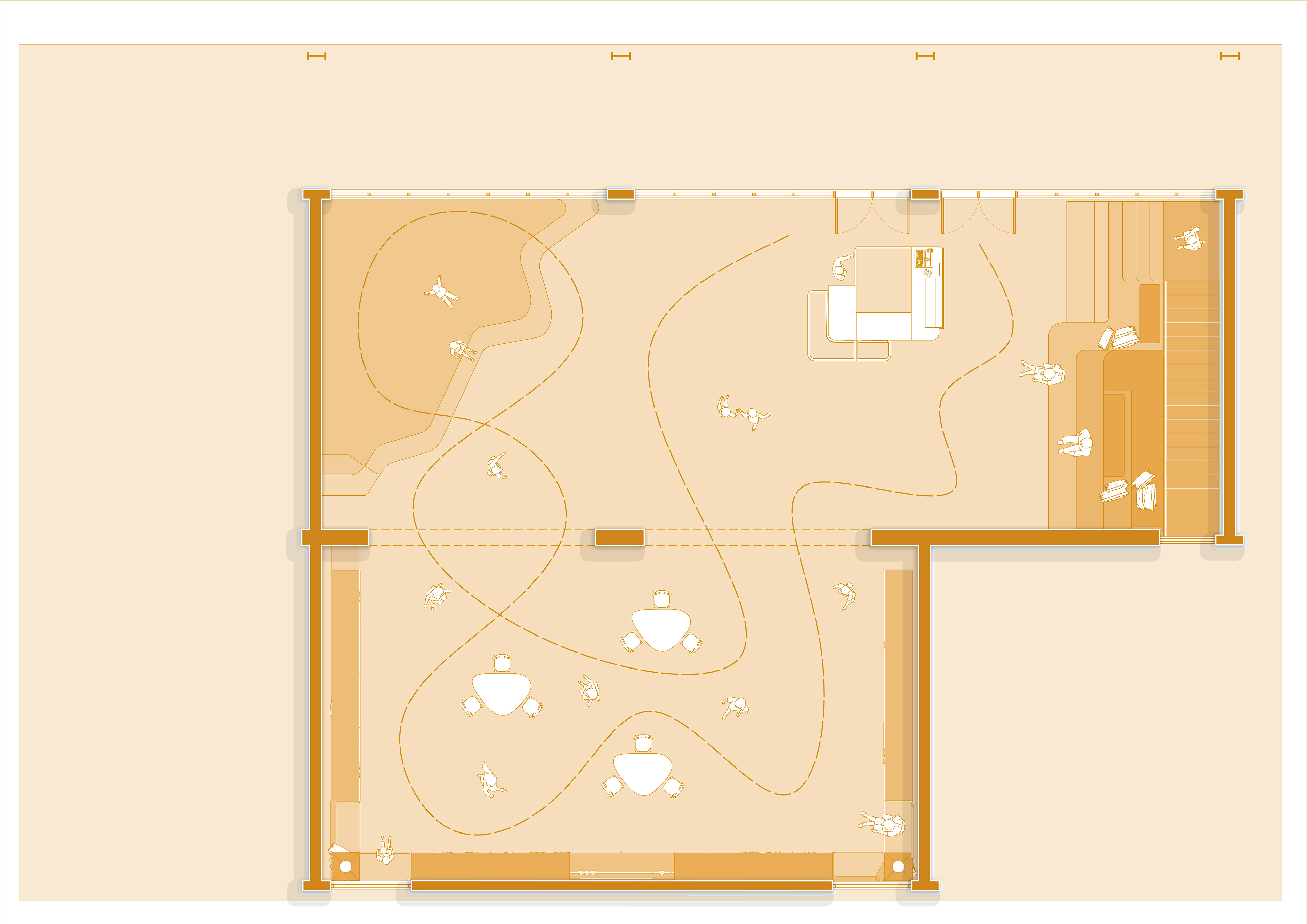
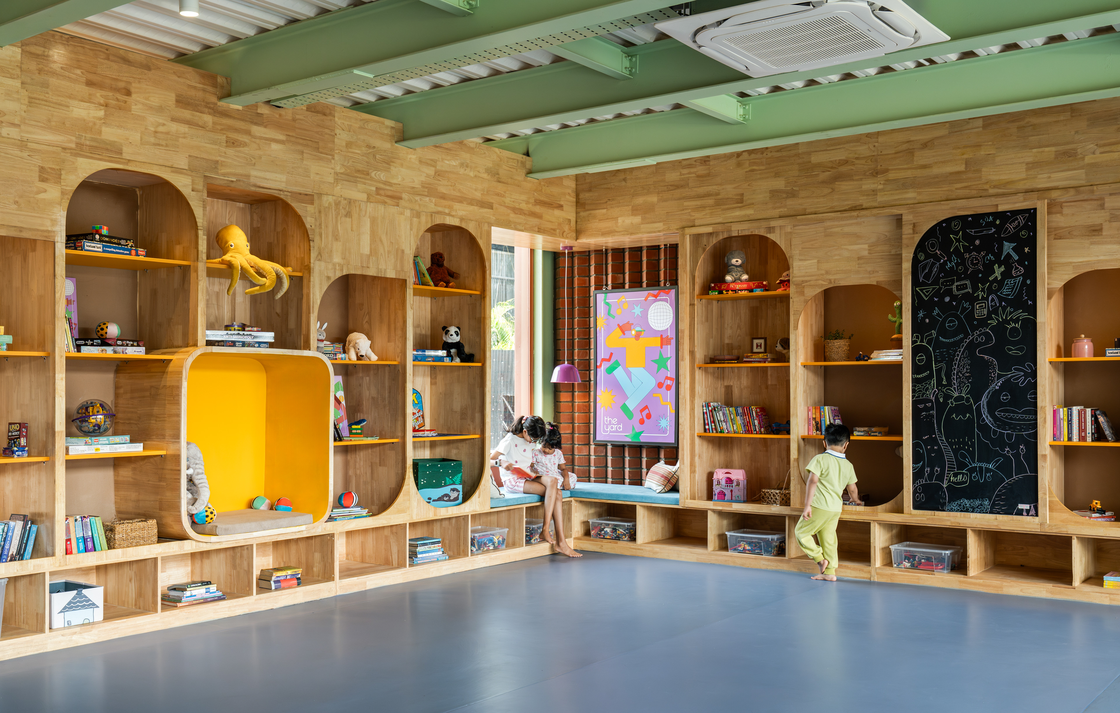
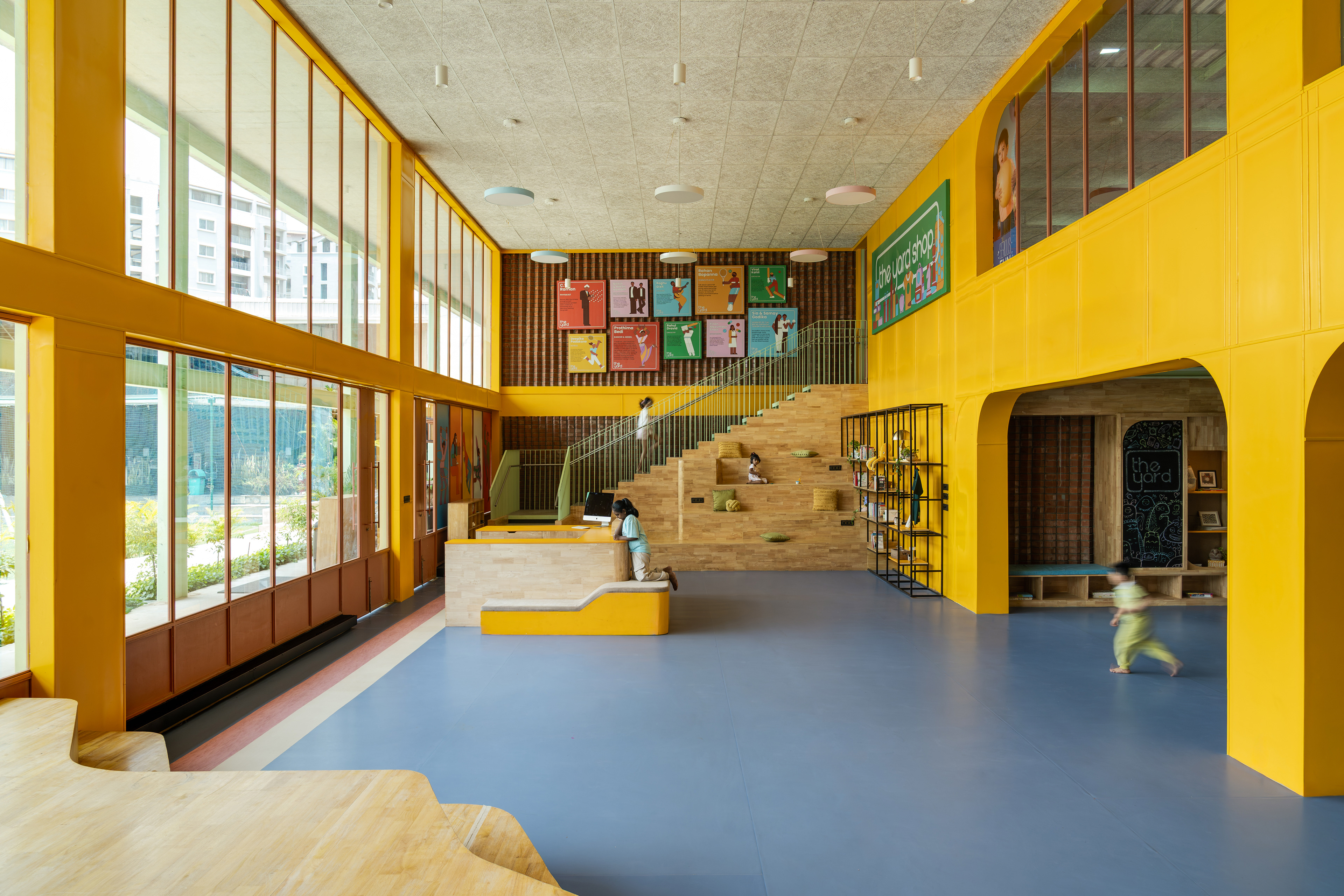
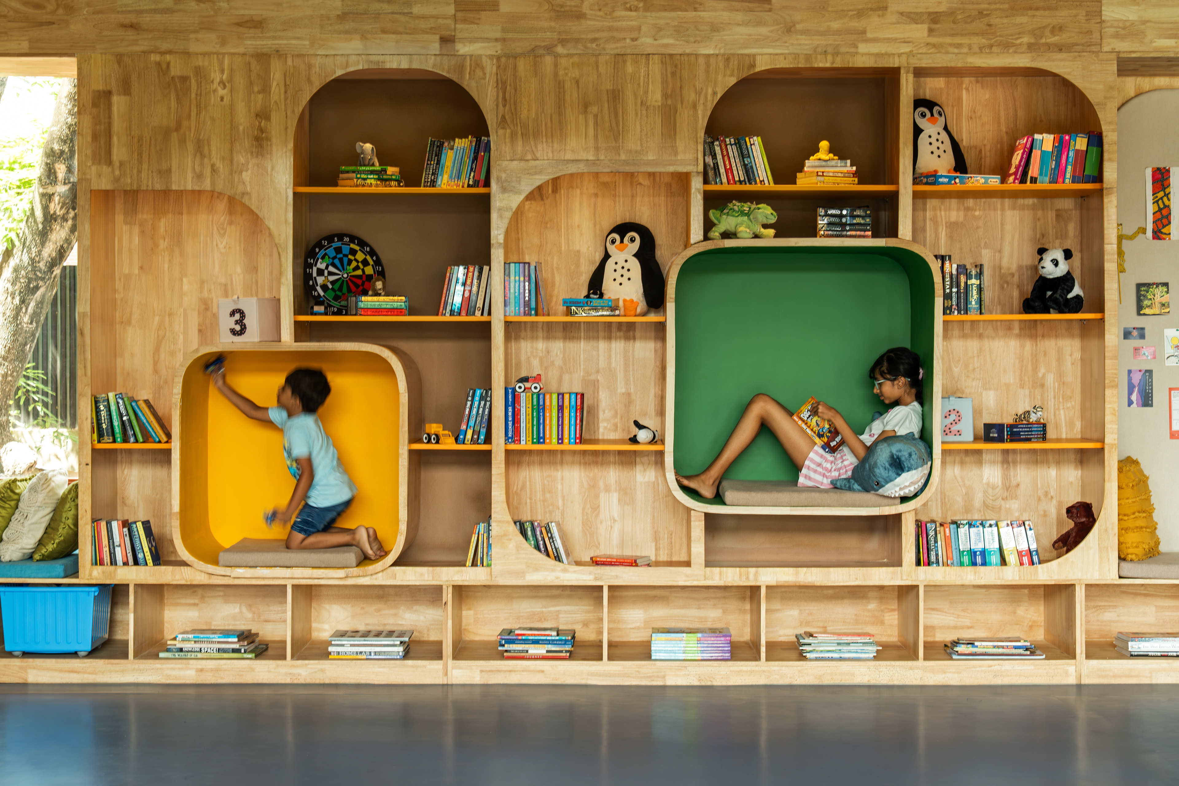
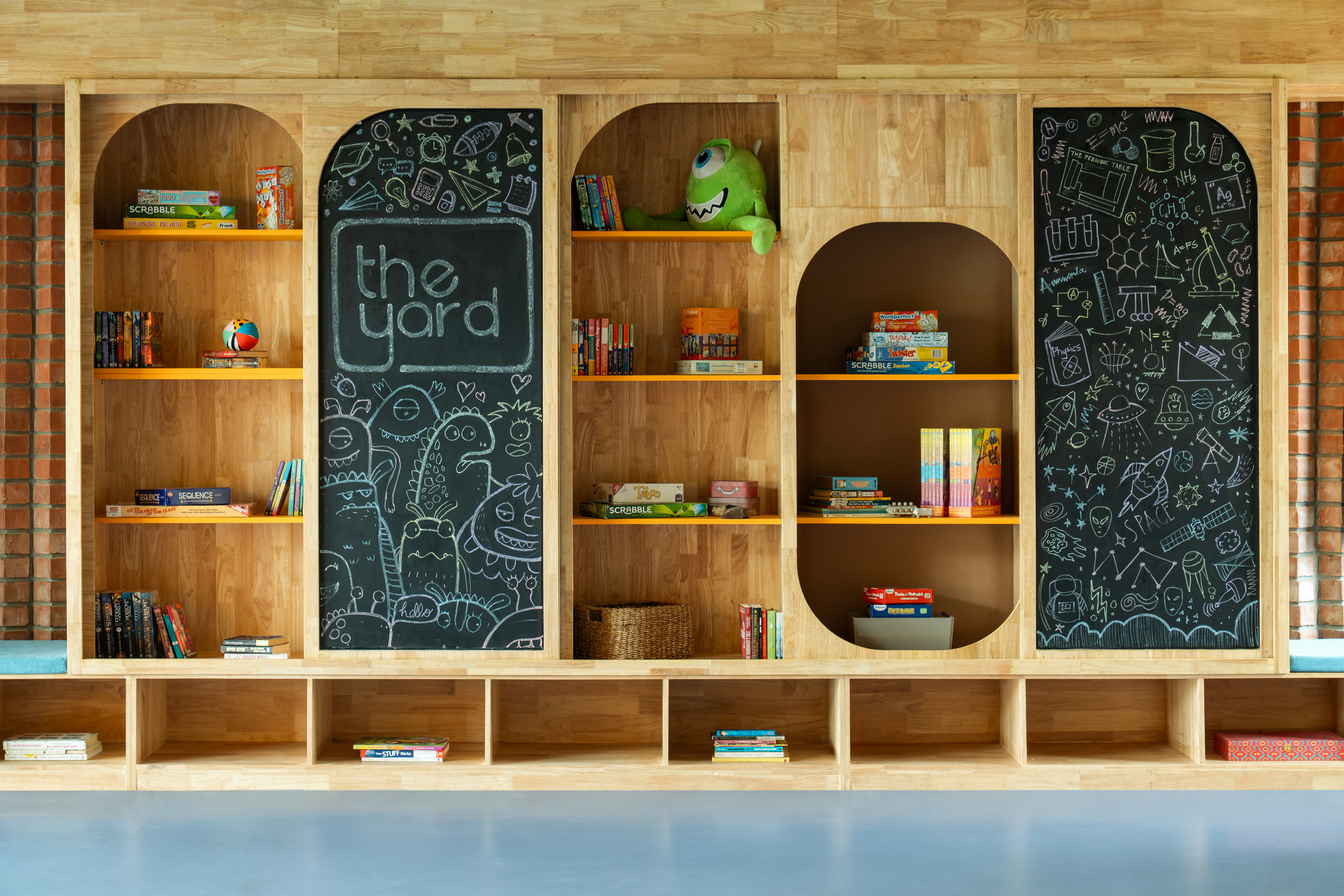
The result feels more like a landscape than a building - levels, contours, open zones, and quieter corners, all held together loosely by the image of an indoor treehouse. The library wall is one of the project's strongest moves. It spans three large walls and serves several purposes at once - storage, teaching support, and an active surface. Books, board games, toy baskets, the everyday materials of a children's space. The main attraction is the movable blackboard panels that slide across the shelving, serving as drawing surfaces, teaching tools, display boards, or even temporary partitions, depending on the day. When closed, they become storage for the more valuable materials behind them. Simple and direct solution built into the design rather than added on top.

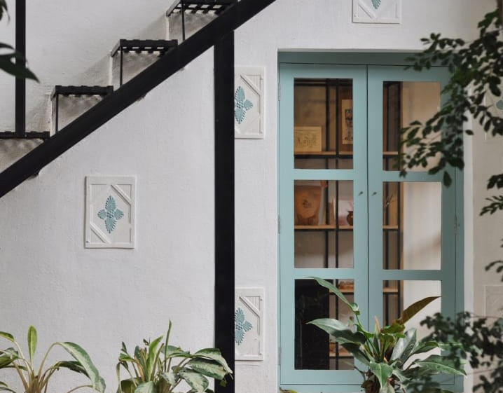
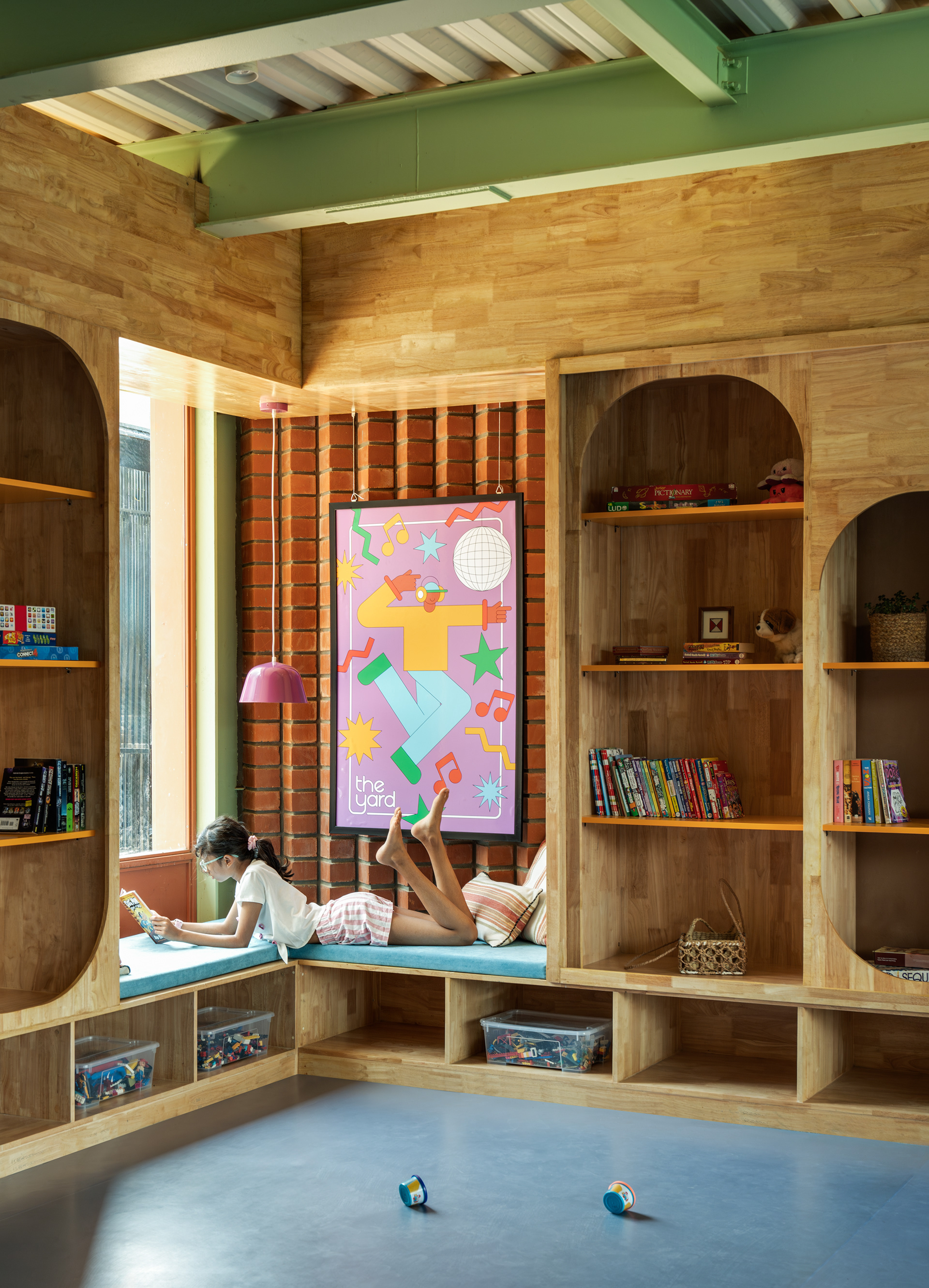
At the corners, window seats are tucked into the walls, creating quieter pockets within the larger room. Most children's spaces are designed for constant stimulation, every surface active and loud. The Yard also makes room for pause - a child can sit back, read, or just watch without leaving the shared environment. That balance between joining in and stepping back is something many children's interiors miss entirely. The message is to just be yourself!
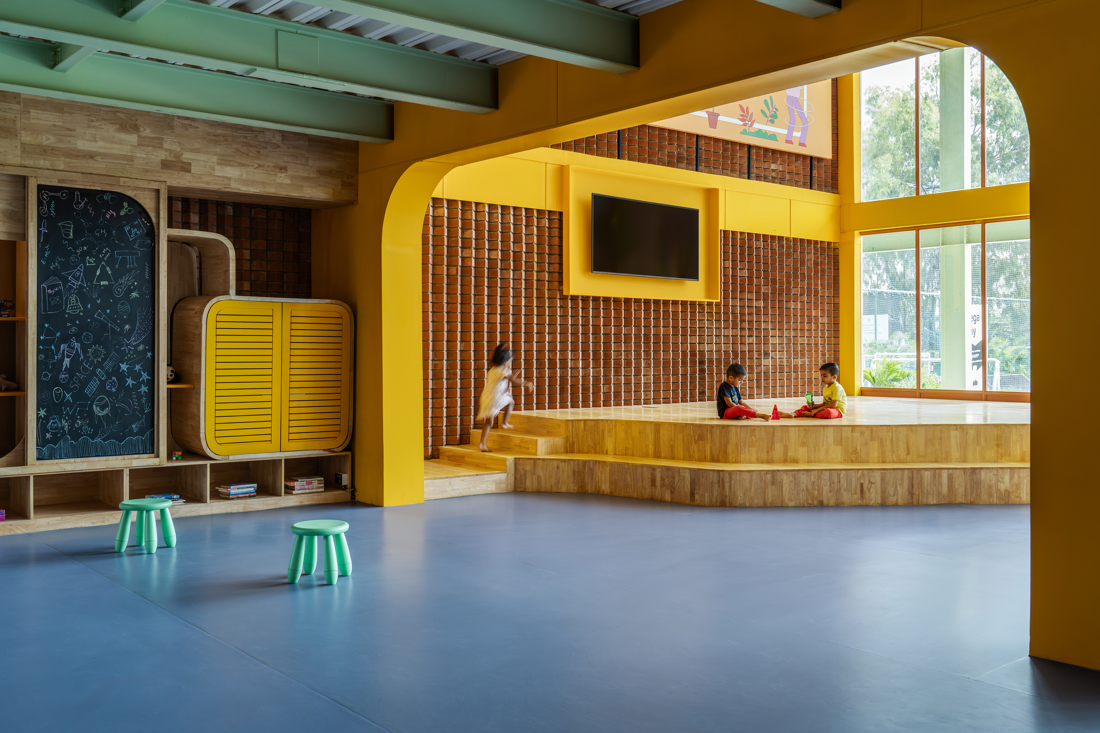
Beneath the staircase, the amphitheatre turns what could have been a dead corner into one of the most-used parts of the space. Stepped seating faces a small performance area and works equally well for storytelling, informal performances, waiting, or watching. Storage is built into the tiers, and plug points are tucked into the seating so parents can work nearby without disappearing entirely. Adults and children share the space without getting in each other's way - which is something we think carefully about at Slip. Not dividing the interior into separate worlds, but finding ways for different kinds of use to overlap naturally.
Adjacent to this is the Yard Shop, currently used for storage and eventually planned as a retail point. The wall artwork here was made with graphic designer Vivan Kamath - figures connected to Bengaluru across sport, music, and science, quietly placed as references for children using the space. It's a small gesture, but a meaningful one.
The amphitheatre area holds up to 200 children during events and scales back easily for the smaller, everyday sessions, and the two-level stage that handles both. Exposed brick, full-height glazing, and bold yellow arches give the room a cheerful warmth and structure. Even the reception desk runs at two heights - lower for young children, higher for adults - so that from the moment of entry, children are treated as the primary users of the space, not guests passing through an adult building.
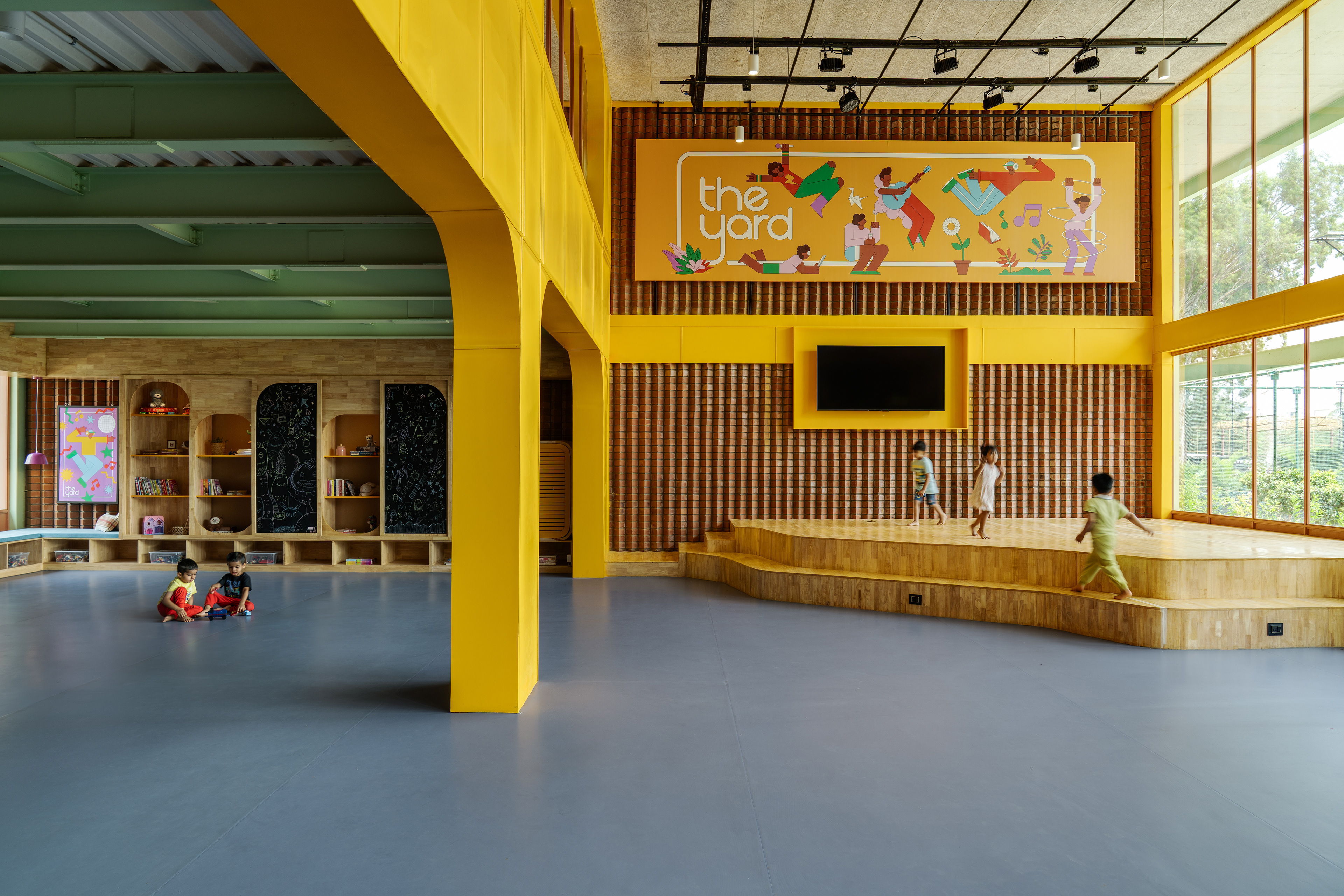

The colour palette is anchored in The Yard's signature yellow, supported by mint green, exposed brick, pine, and a grey vinyl floor, with purple running through the lighting and graphics. The materials - pine, brick, clay walls, and rounded hardwood edges - are warm and chosen for durability. It's a space designed to be used hard every single day, and it looks exactly like that.
What makes The Yard work isn't any single feature. It's the way flexibility, character, and everyday use all hold together - enough structure for a full day of varied activities, enough openness for children to make it genuinely their own. We want them to miss it a little when they go home. That's the kind of space we're always looking for. Not a backdrop or a set. A place with its own logic and warmth, one that supports the people inside it in ways they might not even notice until they've been coming back for months.
The backyard, brought into the city - not out of nostalgia, but out of necessity.